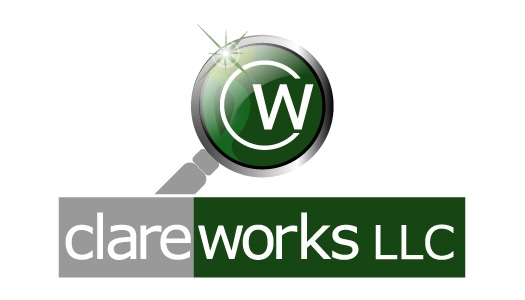
I chose the first part of the company name, clare, which means
bright or clear, to highlight a goal of bringing clear thinking to business. The magnifying lens is a
metaphor for this. To emphasize that this clarity is not in the abstract but practically applied to solving problems,
in particular toward building businesses that work and last, the second part of the name, works, comes about. By
coincidence, the initials of clareworks, CW, are those of my
dad, Clarence Wroe, who taught me everything about hard work and how to make things work. I dedicate this endeavor to him.
There are other parts of the logo that mean a lot to me ranging
from a reference to St. Clare, the letter P, the Crescent, and the green
Star but I'll leave these to a walk along the beach here on the Cape. If when you see this logo you think of the
clarity and practicality I hope to bring, it will have accomplished its purpose.